Overlay charts
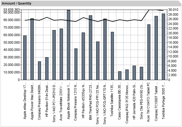
We’ve been asked how to realize an overlay chart and how to place multiple ranges inside a single chart, so this article will show, using a simple example, how to do this.
[toc]
Basically, each chart in instantOLAP is bound to a single pivot table. Overlay charts work generally in the same way, but because an overlay chart is composed from two or more charts, we will also need more than one pivot table to feed the chart with data – each table feeds a single chart. So the first step is to create a block which contains multiple tables.
Providing the chart data
To create the first table, just use the „New pivot table“ button from the right toolbar of the query editor. A new block, containing a single and empty table, will appear. Now drag a fact and a data series to the table, in out example this will be the „Amount“ Fact and PRODUCT level from the Product dimension of the instantOLAP demo model.

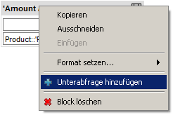
Now you can add a second pivot table to the existing block by opening the context menu of the block (use the right mouse button on the title bar of the block). Use the menu item „Add pivot table“ of the menu to add a second and emtpy table.
Because we want the new table to show data for the same samples, you should use the same iteration for the x-axis of the new new table as you did in the previous table. Only the fact in the y-axis will be a different one, in our example we will use the „Quantity“ fact from the demo model.
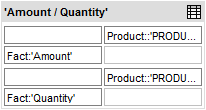
This was the basic step for each chart generation: creating the source table(s) for your chart.
Setting the chart format
It’s time to turn the table into chart: Use the context menu of the block and choose one of the overlay chart types. In out example we’ll use the „Bar / Line“ chart which turns the first table into a bar chart and the second into a line chart.
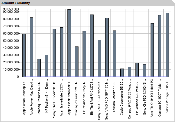
If you execute the query now, you may recognize that there are really two charts, but the second one (the line chart) only displays a flat line at the bottom of the image. This is because till now both charts share the same range and the values for the fact „Amount“ much bigger than for the fact „Quantity“ (or its line). Therefire it’s down to the bottom. and we’ll have to add a second range to the chart and to scale the line to this new range.
Creating a second range
First of all you’ll have to activate the second range. There is a property named „Range 2 On“ which has to be set to „true“. If you execute the query now you will see a second range, but the rest of the chart will look like before, including the flat line chart.
This is because you must assign each of the chart to the ranges. By default, both charts are assigned to the range number 1, which is the default range at the left side of the chart. To re-assign the second (the line) chart to the new range at the right side, use the property „(Overlay) Series Range“ property and set it to „2“ (use „1“ for the first range and „2“ for the second). If you execute the query now you’ll recognize the line beeing scaled over the full image.

Now, you have created an overlay chart with two source tables and two ranges.
Leave a comment